Urban density Around Seattle’s Lake Union
urban infill, density, townhome

Seattle’s urban infill

CAST is closely associated with efforts to moderate density infill within existing neighborhoods in Seattle. Working with two families in parallel, we designed a duo of townhomes near Lake Union. Considerable attention was given to how the facades were grouped, and the way color and pattern emphasized vertical proportions while keeping surfaces in scale. We stitched together spaces between five floors while accommodating the structure needed for multi-level cantilevers over the parking areas. Thoughtful window openings bring lots of natural light and privacy within this tight city lot.

Off-grid Cabin outside leavenworth, Washington
off-grid cabin, siting, exteriors, views, aerials

Icicle Creek Retreat, Wenatchee Forest Washington

Design for snow country

The straight-forward roof of Icicle Creek Cabin is made for its environment. We kept it simple and avoided complex shapes—a roof that holds snow reduces the chance of slough off and provides an energy-saving bonus. Deep eaves and generous covered entries and walkways help keep outdoor circulation free of ice, reduce shoveling, and simplify living.

See more: Icicle Creek Cabin

Contractor: Warm Homes Construction, Aviathar Pemberton
Roofing: OJ Industries Roofing

Siting the Berm house - Methow Valley, Washington

siting the berm house in washington’s Methow valley

Bermed into a meadow, the Berm House has a low profile and opens to the valley panorama of mountains and agricultural fields. The south-facing building orientation optimizes passive heating, and the large overhang protects from snowfall and intense summer sun. The home is post and beam structure with a cross-laminated timber (CLT) roof, prefabricated in northeastern Washington. Thermal bridges are minimized by wrapping the house in continuous external insulation, including under the foundation, isolating the home from outdoor temperature swings. The bermed roof, with 12-inches of soil, adds thermal mass and protection from weather exposure.

CITIES’ BIGGER FUTURE CAN LOOK AND FEEL BEAUTIFUL—IF WE BUILD FOR IT An architect invites cities and towns to zone and design for the futures they want.

Reposted by permission of Sightline Institute

Author: Matt Hutchins (@HutchinsMatt)

rendering, missing middle, seattle, rendering, policy work, planning

A Seattle street showing the inclusion of more middle housing. Rendering by Matt Hutchins, used with permission.

matt hutchins, AIA, PHCD, INVITES CITIES AND TOWNS TO ZONE AND DESIGN FOR THE FUTURES THEY WANT

TAKEAWAYS

  • Seattle has concentrated several decades of population growth within narrow corridors of the city, disproportionately affecting poor and BIPOC communities while failing to ask nearby detached-house areas to evolve and grow as well.

  • Cities and towns with rising housing costs can address home shortages and inequities by opening up their zoning to new design options, as proposed by a middle housing bill that Washington state leaders are currently considering.

  • One such design: the Seattle Six, an attractive, economical, adaptable design that enhances neighborhood vibrancy and prioritizes quality of life, environmental responsibility, and anti-displacement. Cities and towns elsewhere can imitate or design their own such solutions.

If you want a healthy garden, you don’t blast just a couple plants with the hose; you water everything slowly so the roots can soak it up. Same with a city or town: sprinkle some housing everywhere, and you’ll get healthier neighborhoods.

Under Seattle’s Urban Village Growth Strategy the city has funneled 25 years of growth into tightly designated areas without asking adjacent detached-house areas to evolve as well. Along with America’s decades of racist redlining, car-centric design, and the primacy of detached-house building, this kind of strategy has limited what our cities can be. It has sent home prices skyrocketing, deepened racial inequities, and failed to address climate change in how we build our communities. Certain “gentle density” solutions like backyard cottages and townhomes have expanded housing options in tight markets, but for metro areas, the need is greater than these alone can address.

Fortunately, Washington legislators are currently considering a powerful “missing middle” housing bill that would open up a host of modest-sized housing options for people across the state while delivering numerous other benefits for communities. They are reworking zoning rules to empower us to build the future we want. And they are making it possible for architects like me to creatively contribute to the suite of design solutions that can help address the multiple challenges our cities and towns face.

INTRODUCING THE “SEATTLE SIX”

As an architect, I see how zoning regulations, good and bad, directly shape the design of buildings. Right now, there is a once in a generation opportunity to conceptualize the next basic building blocks of our towns and cities, starting from a set of key guiding values:

  • Healthier neighborhoods focused on quality of life

  • Adaptable site design and flexible home configurations

  • Deep green construction and inhabitation over a building’s life cycle

  • Centering anti-displacement

  • New possibilities for ownership, subsidized rentals, and more affordable housing

And while this design was developed specifically for Seattle’s typical lots and market, the values driving it are ones many Washington communities share. This is an invitation—and opportunity—for Washingtonians everywhere to imagine what could be possible in their own neighborhoods.

The “Seattle Six” is a three-story apartment building with six to ten households that fits on a range of typical residential lots. It has a compact form that is optimal for deep green building and observes the same height limits as Seattle’s Neighborhood Residential, Residential Small Lot, and Low-Rise 1 zones. In transit-rich areas, it can accommodate additional stories and units. With a floor area ratio (FAR) between 1.5 and 2.0, the Six is still small enough to bypass thresholds that trigger Seattle’s onerous Design Review. And finally, it proposes a clear direction for the urban design of streets and blocks that works in the short, medium, and long terms, aesthetically and economically.

HEALTHIER NEIGHBORHOODS FOCUSED ON QUALITY OF LIFE

The Seattle Six delivers a range of benefits for neighborhood vibrancy, connection, and attractiveness for residents both in and near Sixes. First, it energizes the sidewalk without overwhelming the street. By reducing the front setback to 12 feet but allowing stoops, covered porches, and balconies in an 8-foot-deep buffer, more residents have access to open space and a connection to life on the street. It replaces the idea of forced façade modulation with the option to embellish and individualize the building, while providing an amenity without complicating the basic structure. Overall, it is similar in height to currently allowed designs and recalls the classic small apartment buildings constructed in the decades before zoning strictures banned them from much of the city.

At the block level, over time, the Six establishes a land use pattern with well-defined urban edges and an interior courtyard in the backyards protected from noise, pollution, and street intrusions. It better preserves existing trees and makes room for new ones, a big advantage over typical oneplexes and townhomes, for instance, which slice up open space into narrow throughways or make backyards the only available land for new housing.

rendering, missing middle, seattle, density, rendering, policy work, planning

The Seattle Six, a modest-sized apartment building designed specifically for lower-density neighborhoods. Rendering by Matt Hutchins, used with permission.

Speaking of backyards, the Six prioritizes access to larger rear yard open space, ample daylight, and options for big terraces for each flat. Units face both the street and the backyard, where kids can play or gardens can flourish, an improvement over another building across a narrow side yard. Residents cycling in will appreciate the design’s easy bike access, accommodating lockable individual bike storage at the ground floor and again in each unit.

Seattle Six, rendering, missing middle, seattle, density, rendering, policy work, planning

Comparison between current and potential zoning envelopes for urban infill development. Illustration by Matt Hutchins, used with permission.

What’s more, on an everyday quality-of-life basis for people living in or near a Seattle Six, the benefits multiply. Because denser housing types bring in new families, one block with ten Seattle Sixes would have enough families with kids under five to justify a small daycare. Five more similar blocks would have enough customers for a successful café. Ten more, and you have a walkable/rollable neighborhood with local jobs, rapid transit, retail, services, and restaurants. At corners, the ground floor units could be live/work, corner stores, daycares, or cafes. Because it fits well with detached house neighborhoods, the Seattle Six can locate away from busy arterial streets and near to places like parks, schools, and libraries, bringing more vitality to every block.

Seattle Six, rendering, missing middle, seattle, density, rendering, policy work, planning

How a block can grow. Top left: typical block of detached houses. Top right: typical townhouse development that would result in tree loss and inefficient use of open space. Bottom left: Ten Seattle Sixes sprinkled through the block. Bottom right: a full block of Seattle Sixes, showing how exchanging narrow side setbacks for larger back yards creates far more useable open space and more room for big trees. Illustrations by Matt Hutchins, used with permission.

In most cases, building a Seattle Six would require demolition of an older structure, just as a big new oneplex does today. This is exactly why Seattle should also allow alternative infill options like backyard ADUs and small-plexes that can coexist with older structures that remain in fine shape.

ADAPTABLE SITE DESIGN AND HOME CONFIGURATIONS

The Seattle Six supports a range of household sizes, multi-generational living, and moving within the building as life situations change. One can downsize and “age in place” or upsize as their family grows without having to give up the community of neighbors they’ve gotten to know.

Seattle Six, rendering, missing middle, seattle, density, rendering, policy work, planning

Ground floor and typical upper floor plan showing flexible range of unit types (click on images to enlarge). Illustrations by Matt Hutchins, used with permission.

Even on lots smaller than the 50’x100’ Seattle standard, the design is flexible enough to offer a variety of unit sizes. Floors can be a mix of family-sized one- and two-bedrooms; they can combine into one large multigenerational floor and later split into a principal flat and mother-in-law; or they can comprise a sprinkling of studios. A single central stair optimizes each floor for living space rather than the dark double-loaded corridors typical of larger apartment buildings. The version shown below is built on a concrete slab at grade level, but a partly below-grade floor of garden units would be practical depending on the topography.

Seattle Six, rendering, missing middle, seattle, density, rendering, policy work, planning

The Seattle Six fits into existing neighborhoods and connects more people to life on the street. Illustration by Matt Hutchins, used with permission.

The ground floor features accessible units via ramp, as well as a flexible studio. Residents can use it for a variety of purposes: for residents with temporary disabilities, housing a caretaker, or a short-term guest suite. Alternatively, it could be a common room, hosting things like teen game nights or get-togethers in a co-housing community.

DEEP GREEN CONSTRUCTION AND INHABITATION OVER A BUILDING’S LIFE CYCLE 

Buildings are a major source of climate emissions, but they don’t have to be. They can incorporate deep green construction that reduces a building’s embodied and operational carbon.

To this end, the Seattle Six is conceived using Passive House principles in its design. The Six’s simple, compact form, continuous insulation to keep interiors comfortable at a consistent temperature, and shared party walls reduce energy loss, paying back residents with a lifetime of low heating and cooling demand. Paired with rooftop photovoltaic panels, the Seattle Six can be net zero energy.

green design, net-zero, missing middle drawing

Diagram of the Seattle Six’s green building features: Passive House, Net Zero, and Dowel Laminated Mass Timber. Illustration by Matt Hutchins, used with permission.

As for materials, the Six’s structure is designed with a dowel-laminated timber structure, which sequesters carbon and minimizes the need for concrete or steel, resulting in a low embodied carbon construction. The mass timber party walls and stair core satisfy the fire resistance rating. And bonus: it can be remanufactured for use in a future project as part of a more circular economy.

The Six also accounts for its region’s natural environment. Its green roof and on-site storm water management limits runoff from the site. And as wildfire smoke becomes more commonplace, the Six’s heating recovery ventilation system not only saves energy but filters pollutants to supply fresh air throughout the building.

COUNTERING DISPLACEMENT

The goal of Seattle’s Urban Village growth strategy was to concentrate new housing around commercial centers and serve them with an expanded transit network. But the strategy’s zoning changes disproportionately landed on poor or BIPOC neighborhoods, such as the Rainier Valley. The consequence has often been a cycle of speculation, displacement, and gentrification at the expense of people who’ve built their lives there.

Having a small apartment building that can plug in anywhere, starting in areas the city characterizes as having “low displacement risk” (i.e., most residents have the means to stay in their homes or find other housing nearby), would reduce the pressure on housing in other, less expensive areas. In a city like Seattle that’s adding lots of jobs, building lots of homes is essential—and the Six is a template for every neighborhood to do its part.

Allowing six or more households to divvy up the cost of Seattle’s pricey land lowers housing costs, too. Efficient, modern buildings like the Six would offer a mid-sized and mid-priced option between detached houses or townhouses on the one hand and large apartment buildings on the other. Indeed, Sightline recently analyzed possible development scenarios under Portland’s new zoning code. It found that new triplexes and fourplexes weren’t quite financially viable there in most cases, but that sixplexes in Seattle’s more expensive market might be.

In other words, the Seattle Six fights displacement in exactly the same way it fights segregation: it creates a new, cheaper way for people to live near jobs, parks, schools, and good public transit while reducing development pressure on other vulnerable neighborhoods.

NEW POSSIBILITIES FOR OWNERSHIP, SUBSIDIZED RENTALS, AND MORE AFFORDABLE HOUSING

We’ve underproduced housing for nearly a generation, putting even the most modest starter home beyond the reach of most Washingtonians. In just a decade, the state’s median home price has increased by 237%. Rents are on a similar trajectory, rising 183% for a two-bedroom apartment over the same period.

Whatever form new development takes, we’ll also need creative forms of ownership: co-ops, urban co-housing, and condos, for example. One interesting idea well suited for Seattle is the Polykatoikia, where landowners who are cash-poor but land-rich negotiate with a developer to swap a new apartment building on their land in exchange for a flat or flats in that new building. It is an excellent way for local landowners to maintain and grow generational wealth, stay in their neighborhoods, and create new homes in the process.

missing middle housing drawing, Seattle Six

The “polykatoikia” idea, or housing swap, by which a homeowner can support new housing, maintain ownership, and resist gentrification. Illustration by Matt Hutchins, used with permission.

To the south, Portland’s Residential Infill Project allows developers to build extra units in exchange for affordable housing. The Seattle Six framework could easily support more households, too: either with an extra floor or a smaller height limit bonus to add a level of garden suites. Seattle’s Mandatory Housing Affordability performance option won’t help private developers create on-site affordable units given the small scale, but perhaps some of the MHA payments taken in by the Office of Housing could be deployed to finance small apartments, similar to how the Equitable Development Initiative has been supporting anti-displacement efforts.

BUILDING THE TOMORROW WE WANT, TODAY

It is a watershed moment for Washington: an opportunity in our housing policy to address climate change and racial inequities while building the homes we need and communities we want. The Seattle Six is just one model of how that might look. It’s also an invitation, as state leaders consider critical middle housing legislation, for communities across the state to boldly envision the future they want and build it into reality.

Matt Hutchins is a principal at CAST architecture, specializing in creative urban infill, affordable housing, green building, and shaping land use policy. He serves on the Seattle Planning Commission and as the Director of Public Policy for AIA Seattle. He is a Certified Passive House Designer. Find him on Twitter at @HutchinsMatt.

University cooperative school Charrette
UCS community charrette meeting, workshop

Seattle’s university cooperative school charrette

A fact of life: community-centered work takes a long time—often five or more years—to turn projects from dream into reality. A shared vision created and owned by the stakeholders is the solid foundation that sustains the project through the inevitable challenges and transitions of this long gestation. One of the main tools we use to help develop this vision is the Community Design Workshop, often called a “charrette.”

CAST architecture is working with University Cooperative School to expand its space in the historic Maxwell Building. Developing such a vision was the focus of our recent workshop with teachers and staff. The group’s excitement coalesced around the concept for a central space we are calling "The Hive," a versatile, warm, and inviting student commons where kids of all ages can cross paths for both structured and unstructured activities.

During the charrette, we used a series of guided design exercises to draw out feedback: a brainstorming discussion; a walkthrough of the unfinished space with the main room dimensions laid out on the floor with tape; a game where participants voted on the appeal of various inspiration images with colored stickers; and a facilitated sketching exercise to document the emerging consensus.

This may have been one of the easiest workshops we have facilitated. With some stakeholder groups, we need to work extra hard to ensure all voices are heard (not just the loudest ones). These elementary school teachers—long accustomed to consensus decision-making—were amazing to work with, ready to jump into each stage of the meeting with insightful comments and actionable suggestions. 

See more at the community section of our website.


Update: El Centro de la Raza Roosevelt Early Learning Center (ELC)
early learning center, education, community

El centro de la raza roosevelt early learning center

Construction progress! This side-by-side construction shot and rendering look down the central circulation spine at the José Martí Child Development Center, which connects the entry, classrooms, and outdoor play area. This new center will provide high-quality Early Childhood Education for 74 children.

A unique aspect of our involvement is that we've been part of the larger team since the early feasibility stage of the project, long before there was a specific childcare provider.

We have played a crucial role in shaping the evolving design of the overall building to ensure the space would be viable as an ELC. From big-picture design elements like the location of the play yard and the relationship of the main entrance to the sidewalk and courtyard; to detailed technical aspects, such as maintaining at-grade egress from toddler classrooms, we’ve provided clear direction to the evolving pieces of the larger building. We ensured the five floors of apartments above wouldn't impinge on the necessary duct and exhaust shafts that allow us to include a much-needed full commercial kitchen in the center.

CAST is proud to be part of the team for the Cedar Crossing affordable housing project, in partnership with El Centro de la Raza, Bellwether Housing, and Mercy Housing NW. On-site child care is an important component of the project, which co-locates resident services in the same building with family-sized housing units.

See more at El Centro de la Raza Roosevelt Early Learning Center.

1960s Split-level Renovation
renovation, seattle home, staircase, entry, exterior

Seattle home renovation

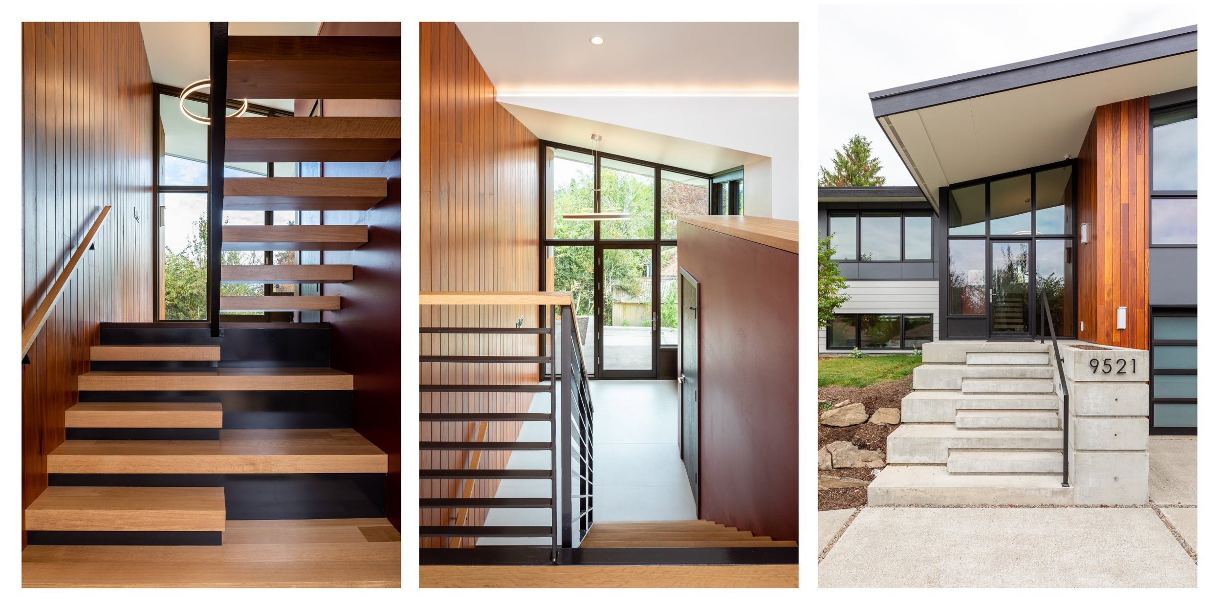
Many Seattleites fall in love with their walkable neighborhoods with tall trees and connection to water, trails, and views. They choose to renovate instead of moving when their family outgrows the home. Originally built in 1963, the full remodel of this split-level house brings an improved layout, more daylight, and updates for modern living.

As a welcoming feature, five-inch wide mahogany siding wraps from the exterior through to the entry. The warm, updated entrance also features floor-to-ceiling windows that flood the adjacent spaces with natural light. While the open staircase brings light into the basement it also emulates the alternating rise from the concrete stairs outside. Accent cove lights wash the ceiling and walls with light in the living and dining spaces.

Green design elements include a roof-top solar array, rainwater collection for irrigation, and pervious paving. The paving system includes a break in the pavement to allow for better drainage to reduce the amount of rain running down the rest of the driveway.

See more: Wedgewood Renovation

Port Gamble S’Klallam Tribe’s Hatchery and Beach Shelter
rendering, pacific northwest design, tribal fish hatchery

A new hatchery & beach shelter for the Port Gamble S’Klallams

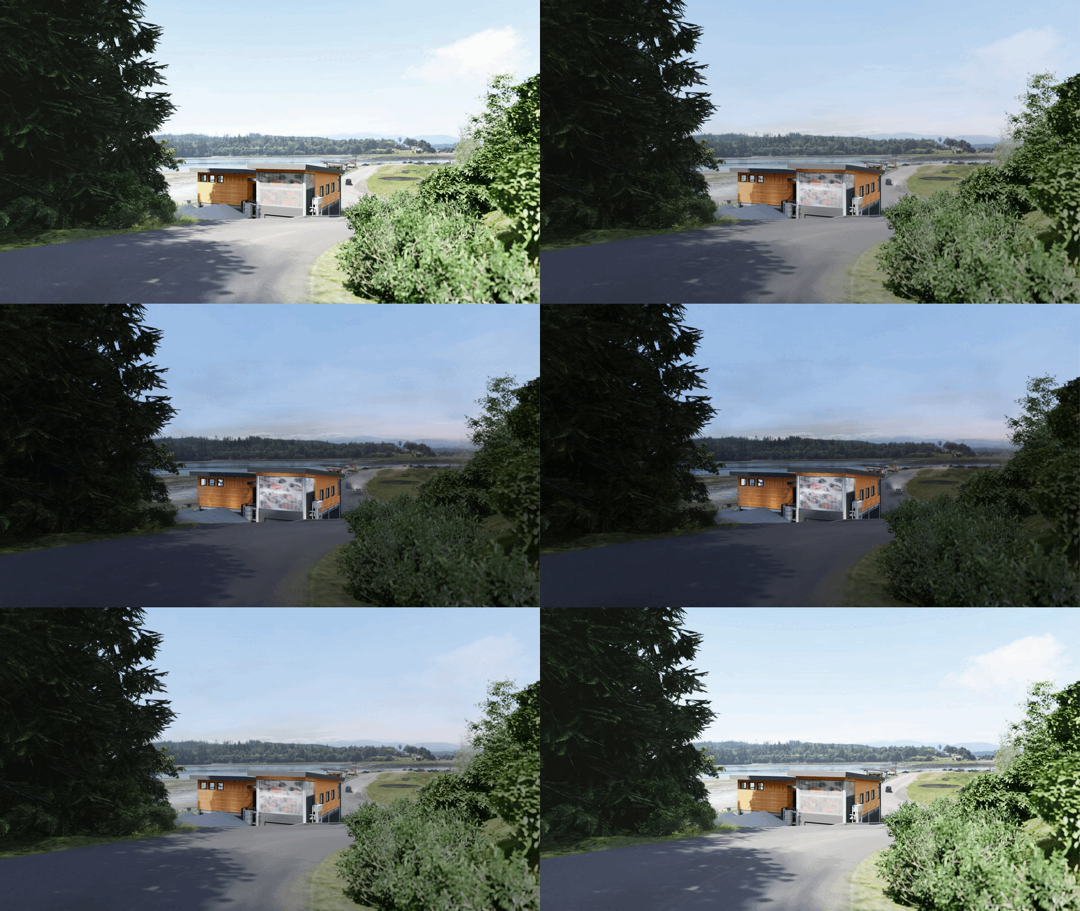
On the beach at Point Julia where their village once stood, the Port Gamble S’Klallam Tribe’s Hatchery and Beach Shelter combines pragmatic uses with symbolic content. Salmon fishing is central to both the Tribe’s traditional identity and its contemporary outlook. This project recognizes the cultural importance of both the place and the program, while providing solutions for these activities to flourish in the 21st century.

Components:

• Two-story salmon hatchery

• Open-air structure shared by Tribal fishermen and the community

• Landscape restoration along the beach between structures

• Reorganization of the hatchery’s water intake system in the adjacent ravine

Point Julia is a prominent spit that protects Port Gamble Bay. This project area falls within a designated archaeological site that is both a busy workplace for the Tribe’s commercial fisherman and a popular recreation area. It is also the burial ground of their ancestors. Within this sensitive zone, we have limited the building footprint to areas already disturbed by prior construction.

In traditional Salish building in the intertidal zone, permanent poles fashioned from tree trunks were sunk deep into the sand, then clad with removable cedar planks. In a modern analogue, exposed auger-cast concrete piles support a lighter skin of glass, polycarbonate, and wood.

While minimizing excavation, elevating the hatchery on piles allows the lower level to withstand up to three feet of storm-driven tidal flooding. Flooding is predicted to become increasingly common as the effects of global climate change are felt locally. The lower level houses a garage, maintenance shop, and egg-incubation room with equipment that is both durable and moveable. The upper floor contains offices, water-quality testing, and filtration equipment. The spectacular conference room on the southwest corner can be entered separately, accessible to the wider community.

The second story of the hatchery emerges above Point Julia Drive at eye level to the road. Within the lantern of the enclosed porch, we are working with S’Klallam artist Jimmy Price to create a site-specific installation to mark this arrival point.

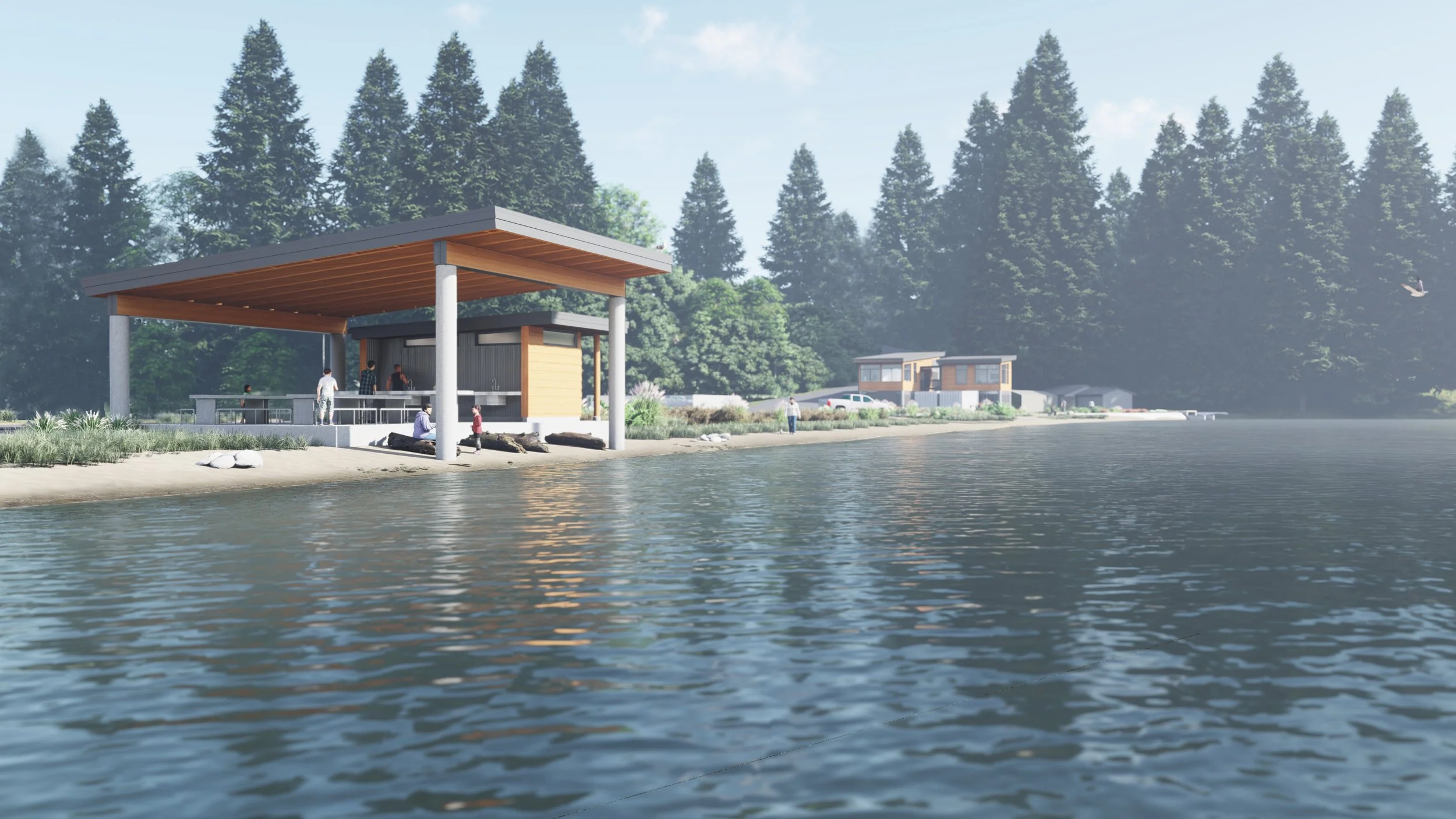
If the new hatchery forms a gateway to the beach from the landward side, the beach shelter is the Tribe’s front door on the sea. It will provide a work area for fishermen who pull their boats onto the beach and will also anchor the arrival of the annual Canoe Journey, the region’s most important inter-Tribal celebration. The shelter’s high roof encloses both hardscape and a generous slice of beach. Its oversized beams and exposed rafters make an explicit nod to traditional wood construction. A low-roofed plumbing core that echoes the hatchery houses hygienic cleaning sinks and the beach’s first public restrooms.

On the beach between the two structures, we will restore the native landscape in a way that continues to welcome the community. Existing paths are strengthened and the future pedestrian connection with the Tribal Center is initiated. Our experience of a summer afternoon on the beach with Tribal elders drives the landscape palette; along with salt-tolerant erosion control plantings, the beds reintroduce traditional edible and medicinal plants.

rendering, pacific northwest design, tribal fish hatchery Fishery rendering, hatchery rendering

Rendering of the hatchery building

rendering, beach shelter, rendering, pacific northwest design, tribal fish hatchery

Rendering of the beach shelter, with the hatchery building in the distance

Reichert House & Studio renovation Featured in DWELL!
Dwell magazine, reichert house restoration, mid-century modern renovation

Reichert house restoration, Seattle

“There are moments where I look around and feel like I’m living inside a work of art,” says homeowner Darin.

Through this down-to-the-studs renovation, CAST pays homage to modernist architect Robert Reichert’s former Seattle home. See more at Reichert House & Studio.

@dwellmagazine
Photography: @andrew.giammarco
Words: Lauren Gallow @desert.ren
Constructed by: @dboone0911
Structural Engineer: @swensonsayfaget
Landscape Design: Maggie Payne
Lighting Design: Luminous NW Entry tile: @pophamdesign
Entry metal work: @seattlemetalproducts

Neighborhood Residential
green zoning, missing middle housing, seattle housing, density

seattle neighborhood residential

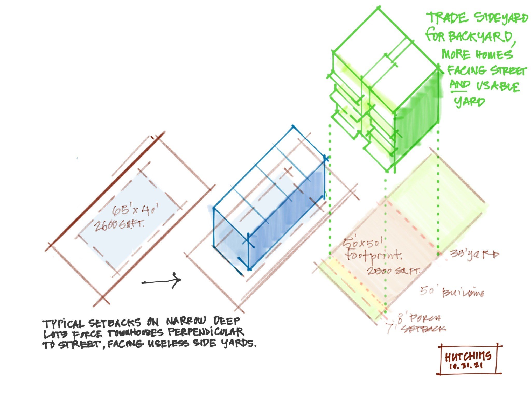
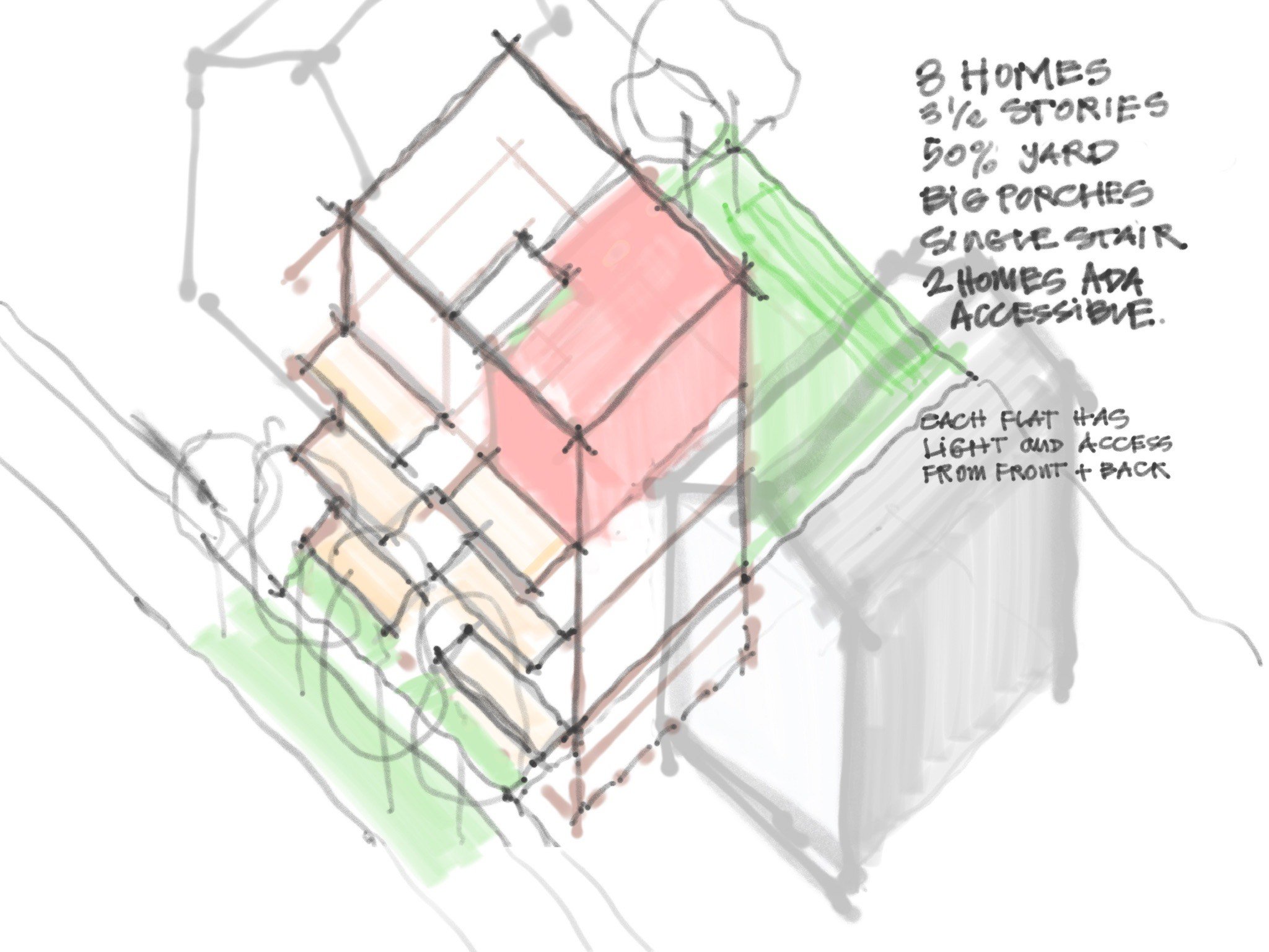
Green Zoning means going beyond detached houses and townhouses, to a more urban, green residential type. Let’s trade the sideyard for a backyard with more homes facing the street with a useable yard. The typical setbacks on narrow, deep lots force townhomes to be perpendicular to the street and facing useless sideyards.

  • Reduce front yard setback and eliminate side setback

  • Porches and balconies can extend in front

  • Max. depth 50% of the lot, apartments with window on street and larger backyard

  • A compact form is easy to build and energy efficient

  • Space for 3-10 households per parcel

  • Works for larger units - less floor area wasted on stairwells

  • Backyard trees remain

If we want to crack the housing crisis, ADUs aren’t enough. We need a repeatable adaptable accessible single-stair, #Passivhaus 6/8/10plex that can be financed, permitted, constructed nearly everywhere on a margin that makes it more profitable than townhomes or detached homes.

green zoning, missing middle housing, seattle housing, density